| Issue September-22 | ||
 |  |
|
| ·Home ·Politics ·News ·Sport ·Life ·Culture ·World ·Essays ·Technology ·About | ·Archive | |
| ||||||||||||||
Weeping Apple: When Design Takes a Back Seat |
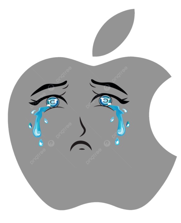 |
Apple's latest OSX release, Tahoe, has sparked a wave of criticism - from confusing translucent displays to the loss of professional tools like Aperture. Once a company driven by design brilliance under Steve Jobs and Jony Ive, Apple now seems focused on uniformity, operations, and style over substance. What does this mean for longtime Apple users? Weeping Apple The release of Apple's new Tahoe (OSX 216) has triggered a wave of complaints, most of them aimed at the irreversible introduction of translucent displays. If customer voices matter, Apple should be weeping. Only one person could ever have come close to being the true heir to Steve Jobs: Jony Ive. Jobs once called Ive his "spiritual partner at Apple." Both were innovators. Tim Cook, by contrast, is not. Cook's background was in operations, not design. As Chief Operating Officer under Jobs, his domain was efficiency, logistics, and administration - not creativity. After Jobs's death in 2011, Apple's priorities shifted accordingly: more focus on services, finance metrics, and efficiency, and less on design-led innovation. Ive reportedly grew frustrated as Apple's leadership tilted toward people with operations and finance backgrounds rather than those with technical or design sensibilities. He left in 2019. To Cook's credit, Apple has doubled its market value under his tenure. Yet critics argue that almost any competent manager could have ridden the momentum of Apple's culture and products in those years. Few know that Steve Jobs was born Abdul Lateef Jandali, later adopted and renamed Steven Paul Jobs. More importantly, Jobs's Apple thrived on risk-taking and design brilliance - qualities that began to fade after his passing. Take photography. Apple once offered Aperture, a tool less powerful than Photoshop but vastly superior at organizing large photo libraries. Many professionals considered organization more important than post-processing, especially for high-volume shoots: One well-known American photographer reportedly handles up to 8,000 images at a single wedding, where there simply isn't time for editing each shot individually. Killing Aperture was just one sign that Apple's priorities were shifting toward mobile devices and the iPhone, at the expense of professional users. Apple now claims its goal is to make the experience of using an iPhone, iPad, or Mac as identical as possible. On paper, this sounds reasonable. In practice, it has been disastrous. The new translucent GUI is a prime example. It confuses rather than clarifies, blurring the line between background imagery and foreground controls. Fundamental principles of interface design - once Apple's pride - are being ignored. Instead we are given what looks like an advert for a love-parade in blue, style over substance, more concerned with appearances than usability. Perhaps there are remote corners of the world where users value aesthetic flourish over functional clarity. But those are not the core Apple users. Judging by the avalanche of criticism, Cook's latest design choices risk alienating the very community that made Apple strong. Maybe it is time for Mr. Cook to seek new pastures. |
| London: 21. September 2025: -pw- |
| Source: WessexTimes, Daily Telegraph |
| The views expressed in this article are the author's own and do not necessarily reflect WessexTimes editorial stance. |
|